Digipack
Digipack
For my digipack, I chose to use the polaroid photos I had taken during my shoots, and thereafter, used my photos of them for my covers.
I edited my photos on AE and on Premiere Pro, before adding them into photoshop.
.png)
.png)

My texts:
For my texts, I chose to use fontmeme, in order to use handwritten fonts. Originally, I was going to use my own handwriting for the front cover, but decided against this, as the generated handwritten fonts looked more professional and more sophisticated - which is the style I was going for.
 |
| Experimenting with handwritten fonts for my main artist |
 |
| Experimenting with handwritten fonts for my featuring artist |
Digipack planning:
1. Designing song names:
For designing the song names on the album, I used a song name generator on Google, and decided to figure out what other song titles would be related to my theme of memories and the general idea of broken relationships.
For one of my titles, I decided to use the cool generator website in order to generate the different song titles:

After generating several song names on many name generators, I curated a list of song titles, which all match with my theme of reminiscing a broken relationship to the eventual healing of one's self.
Official song titles:
- Admiring Troubles
- Affair at Pacific
- Table for Naked
- bomb game
- i am crazy
- kiss of life
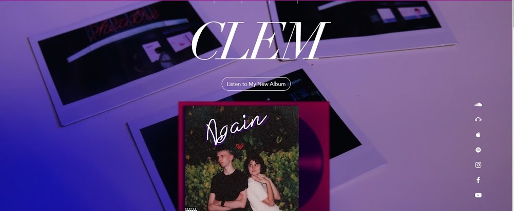
- Again
- confused riot
- homesick promises
- missing piece
- loading…
- true beliefs
Although majority of my song titles are derived from song generators, I took inspiration from Lana Del Ray’s typical song titles, as her song tracks usually are as literal as the song:
Her song titles:
- Summertime Sadness
- Doin’ time
- Cinnamon Girl
- West Coast
- Young and Beautiful
- Art Deco
My photos after editing:

 |
| I chose to hand draw a broken heart between the two artists (lovers) to depict the broken relationship between them. |
.jpg)

My digipack:


I chose to add a handwritten font of "much love xx", as though the lovers had written it on the polaroid themselves, in order to make the polaroids seem more authentic and more personal to the broken relationship.
For my final title, I chose to overlap 2 writings together; not only so that the title would stand out, but also depict the idea of the two lovers being hopeful of rekindling their passion for each other, 'again'. I specifically chose the colour purple, as it represents the lust and affection of the lovers to each other.
For the artist name, I chose to follow suit with my colours used for my song title, purple and white, and overlapped the fonts, over black, so that it creates a 3D effect, but is also easily readable for all audiences to access, and thereby understand who the artist is.
For the featuring artists of my song, I used fantasynamegenerators, to come up with names for my artists. I finally decided to name the featuring artist on my title song, "Again", as "OSI", as it's a short and simple brand image for the artist. I chose inspiration from my original featuring artist, "XXXTENTACION", and as he was often referred to as simply "XXX", I chose to emulate that with my artist.
Inspiration
For the back of my album cover, I derived inspiration from https://dribbble.com/shots/5608700-Oxnard
an album design for Anderson Pak.

For the back of my album cover, I derived inspiration from Ariana Grande's "thank u, next" album design, as her songs titles are arranged in the centre of the cover, and are in small, formal typography, thus, I chose to emulate her stylistic choices in my album cover.


Comments
Post a Comment